Case Study: Famous Logos and Their Evolution
Logos are a crucial part of a company’s brand identity. They serve as a visual representation of what the company stands for and can evoke certain emotions and associations in consumers. Over time, many famous logos have undergone significant transformations to stay relevant in the ever-changing marketplace. In this case study, we will explore the evolution of some of the most well-known logos in the tech industry.
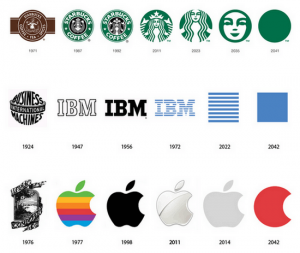
Apple
One of the most iconic logos in the tech world is the Apple logo. The original logo, designed by co-founder Ronald Wayne in 1976, featured Sir Isaac Newton sitting under an apple tree. However, this logo was short-lived, and in the same year, the now-famous bitten apple logo was introduced. This simple yet memorable logo has remained relatively unchanged over the years, with minor tweaks to the color and shape. The logo has become synonymous with innovation and cutting-edge technology, reflecting Apple’s brand values.
Microsoft
Microsoft’s logo has also undergone several transformations since the company was founded in 1975. The original logo featured a stylized “O” with a line through it, symbolizing a digital readout. Over the years, the logo evolved to incorporate multiple colors and fonts before settling on the current design in 2012. The four colored squares represent the company’s diverse product offerings, while the typeface is clean and modern, reflecting Microsoft’s commitment to innovation and simplicity.
Google’s logo has become one of the most recognizable in the world since the company’s founding in 1998. The original logo featured a simple font with a different color for each letter, reflecting the company’s playful and creative approach to technology. In 2015, Google introduced a new logo with a modern sans-serif font and vibrant colors. The new logo is sleek and easy to read, reflecting Google’s focus on simplicity and user experience.
Amazon
Amazon’s logo has also seen significant changes since the company was founded in 1994. The original logo featured the company name in a serif font with a stylized river flowing through it. In 2000, the logo was updated to include a curved arrow, symbolizing the company’s commitment to delivering everything from A to Z. The current logo, introduced in 2000, features a simple font with a subtle arrow pointing from the “A” to the “Z,” highlighting the company’s vast product catalog and customer-centric approach.
Conclusion
These case studies highlight the importance of logo design in the tech industry. A well-designed logo can communicate a company’s values and differentiate it from competitors. By evolving their logos over time, these tech giants have been able to stay relevant and appeal to modern consumers. As technology continues to evolve, we can expect to see more changes in the logos of tech companies as they strive to stay ahead of the curve.
Remember, a logo is not just a symbol – it’s a representation of your brand and what it stands for. Take inspiration from these case studies to create a logo that will stand the test of time and truly resonate with your target audience.